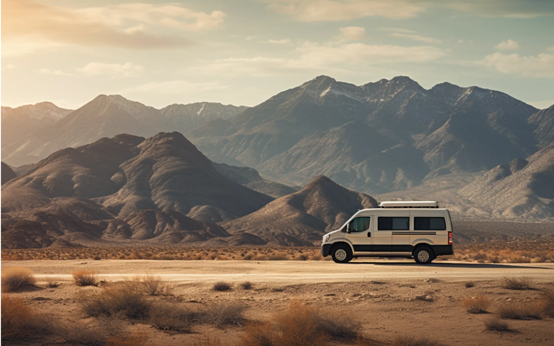
Whitespace is key to clear design.
Space is the cheapest design element available and the first one most pages give up. Here is what it buys.


Space Is Not Emptiness
The room around an image is doing work: it separates, it groups, and it tells the eye how long to stay. A page with generous margins does not have less on it. It has the same content, organised so that a visitor can take it in without effort.
On a photography site this matters more than almost anywhere else, because the content is the one thing you cannot afford to have looked at quickly.

Group by Proximity, Not by Line
Two things close together read as related; two things far apart read as separate. That is a stronger signal than any border or background colour, and it costs nothing. Most cluttered layouts can be fixed by adjusting four spacing values rather than by adding rules and boxes.
The practical version: make the gap inside a group smaller than the gap between groups, everywhere, without exception. It sounds trivial and it resolves most alignment complaints.
If a layout looks cluttered, the answer is almost never another divider. It is more space, in fewer sizes.
Use a Scale, Not a Guess
Spacing chosen ad hoc produces a page with fourteen slightly different gaps that nobody can name. We work from a fixed set of steps and use only those, which makes every future decision faster and keeps the rhythm consistent across pages built months apart.
The steps in this template are custom properties at the top of the stylesheet. Changing one changes it everywhere it is used, which is the whole point of having them.

Give the Text Room to Breathe Too
Line length, line height and the space above a heading are the same tool applied to type. Sixty to seventy-five characters a line, generous leading, and more space above a heading than below it, so the heading belongs to what follows rather than floating between.